Calming & Minimalist Color Palettes for Punch Needle Art
Hi, I’m Sibel! 🧵
I love working with bright yarns, but sometimes you just need a break. When I want to stitch something clean and relaxing, I always go back to soft, muted colors.
The great thing about lighter tones—like pale pastels, soft grays, and creamy whites—is that they actually let the texture do all the work. Without loud colors distracting the eye, those fluffy punch needle loops really stand out.
These soft palettes are my go-to for minimalist rooms, nursery gifts, or just for those days when I want a calm, easy crafting session. If you want to keep things light and simple, here are 5 foolproof color combinations to try on your next punch needle template!
1. Spring Awakening — Soft Pink, Pale Yellow, Sage & Cream
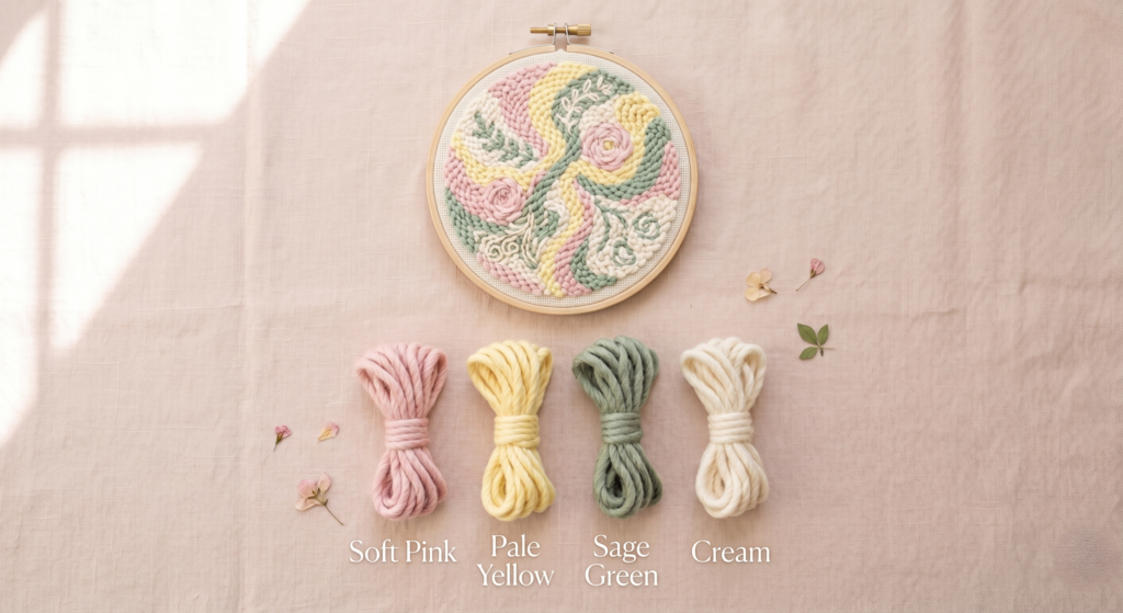
Soft, cheerful, and full of good energy. This palette is ideal for smaller, quick projects like punch needle keychains, cute bookmarks, or mini coasters. It works beautifully with kawaii-style patterns or simple floral templates.
- Pro tip: Pale yellow can easily take over. Use it for small details and let the soft pink and sage do the heavy lifting.
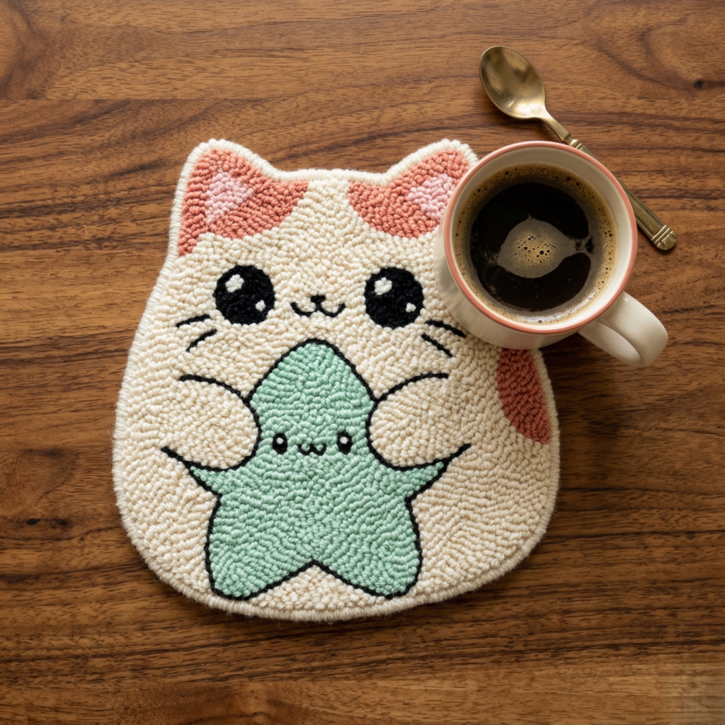
Make it yourself: These calming, pastel colors look absolutely beautiful on my cute coaster designs. You can grab my Squishy Animal Punch Needle digital template and try this project tonight!
2. Winter Frost — Soft White, Icy Blue, Cool Gray & Silver
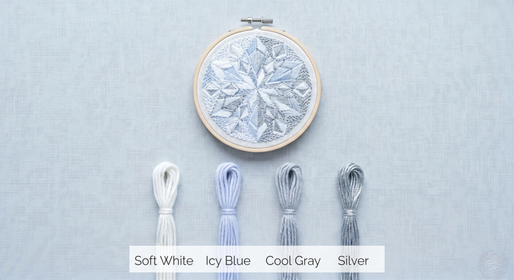
A crisp, clean, and modern palette. Cool tones actually make the fluffy texture of punch needle loops stand out even more. It’s a great choice for minimalist interiors.
- Pro tip: Because these colors are light, any gaps in your stitches will show. Keep your loops tight and your tension even!
3. Sunset Romance — Coral, Peach, Rose & Lavender
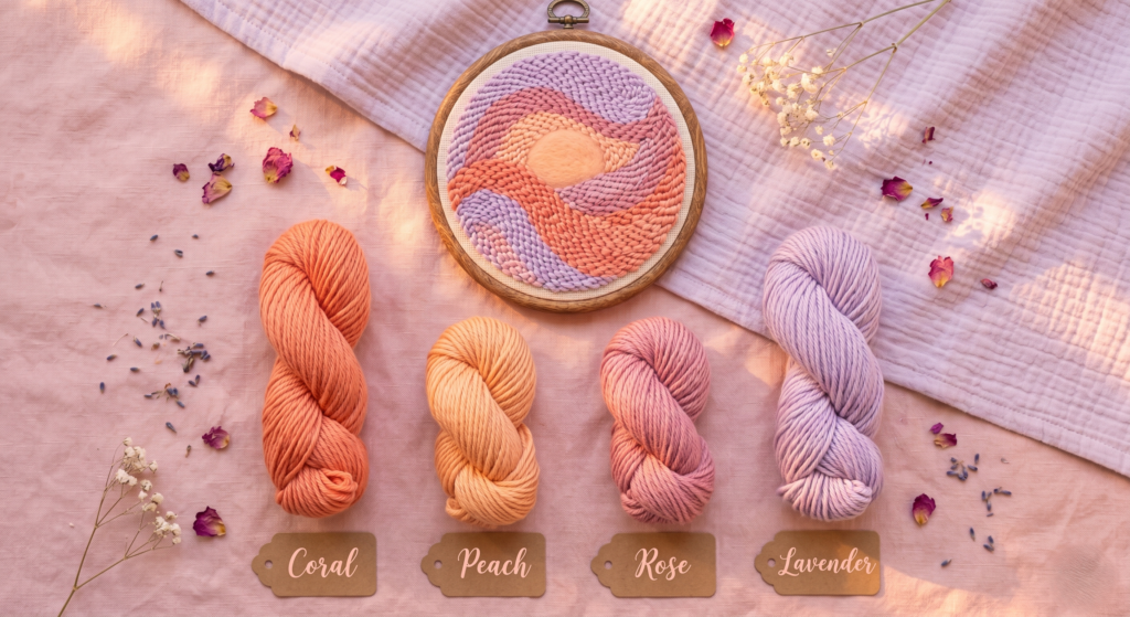
Warm, soft, and a little bit dreamy. This combination is beautiful for bedroom decor or nursery gifts. It’s gentle enough for intricate, curvy patterns and looks incredibly soft when you use the fluffy side of the punch needle.
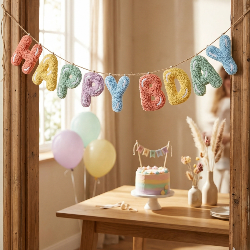
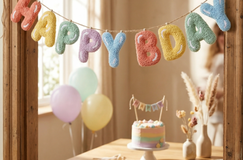
Make it yourself: These gentle, calming colors look absolutely beautiful on my fluffy letter designs. You can grab my Punch Needle Alphabet digital template and try this project tonight!
4. Vibrant Blush — Hot Pink, Cream, Soft Gray & Sage
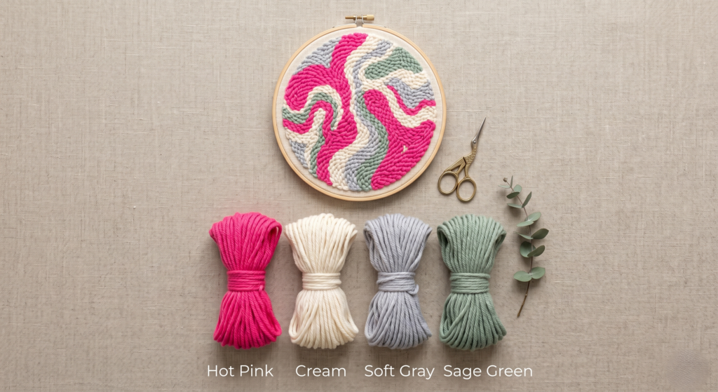
If you want to use bright colors without making your project look childish, this is the perfect balance. The hot pink is vibrant, but the cream, soft gray, and sage instantly ground it. It feels confident, modern, and warm.
This combination is great for spring and summer decor, especially for young professionals or anyone who loves a pop of color that isn’t too overwhelming. It works wonderfully for larger punch needle projects like wall art or cushion covers.
- Pro tip: Let the hot pink be your leading color, but use it intentionally. The sage and soft gray will naturally soften the overall look.
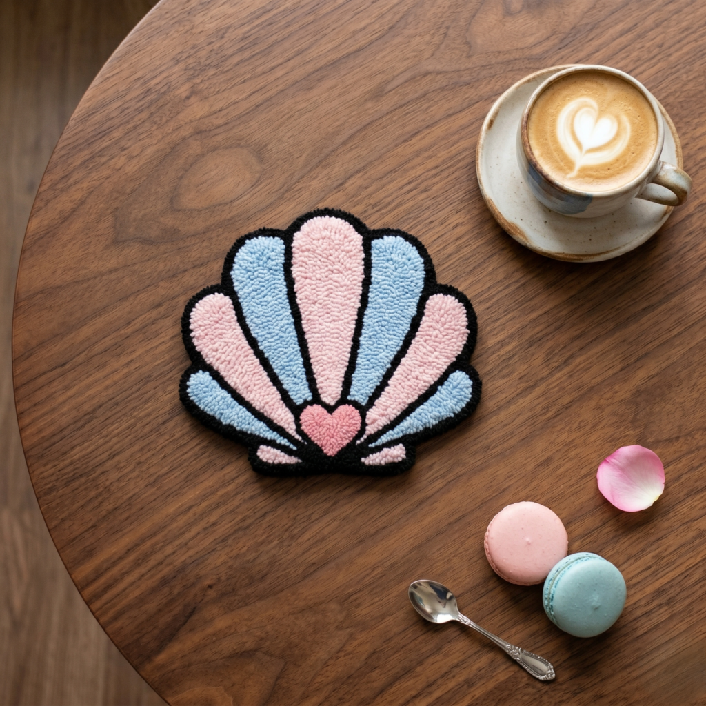
Make it yourself: This modern pop of color looks absolutely beautiful on my fun summer designs like seashells and macarons. You can grab my Punch Needle PDF digital template and start this playful project right away!
5. Coastal Breeze — Navy Blue, Coral Red, Golden Yellow & Cream
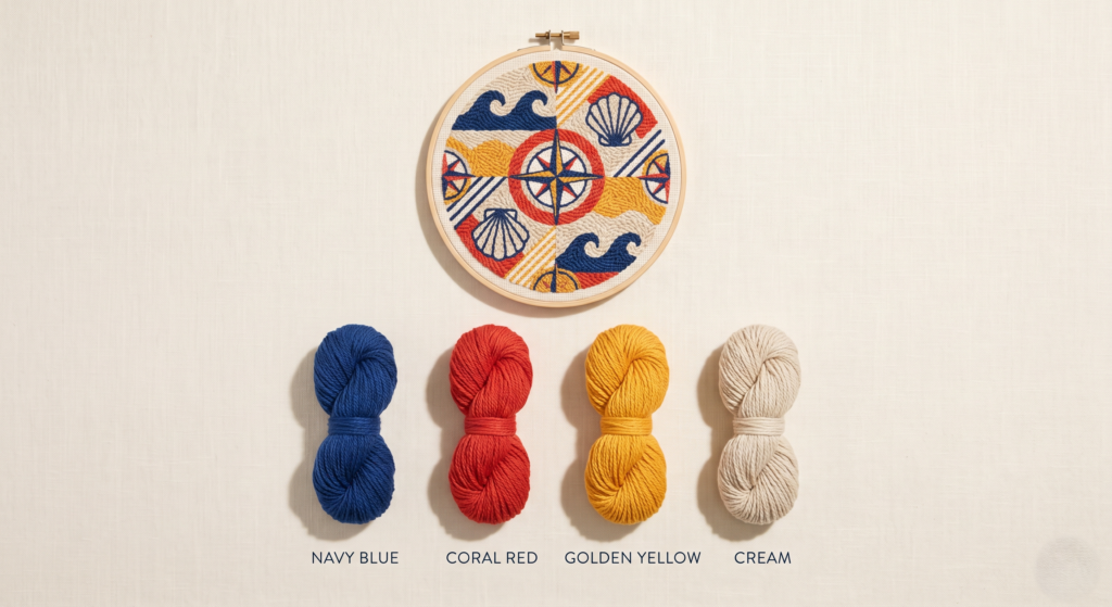
This is a fresh, modern take on classic nautical colors. Navy blue and cream give that clean, coastal feel, while coral red and golden yellow bring in the bright warmth of summer sunshine.
This combination is incredibly versatile and looks stunning in modern, eclectic, or beach-inspired homes year-round. It is perfect for larger punch needle templates, bringing a cheerful, relaxed vibe to a living room or nursery.
- Pro tip: Navy blue is a strong color, so don’t let it overpower your design. Leave plenty of negative space with the cream yarn so your pattern can breathe.
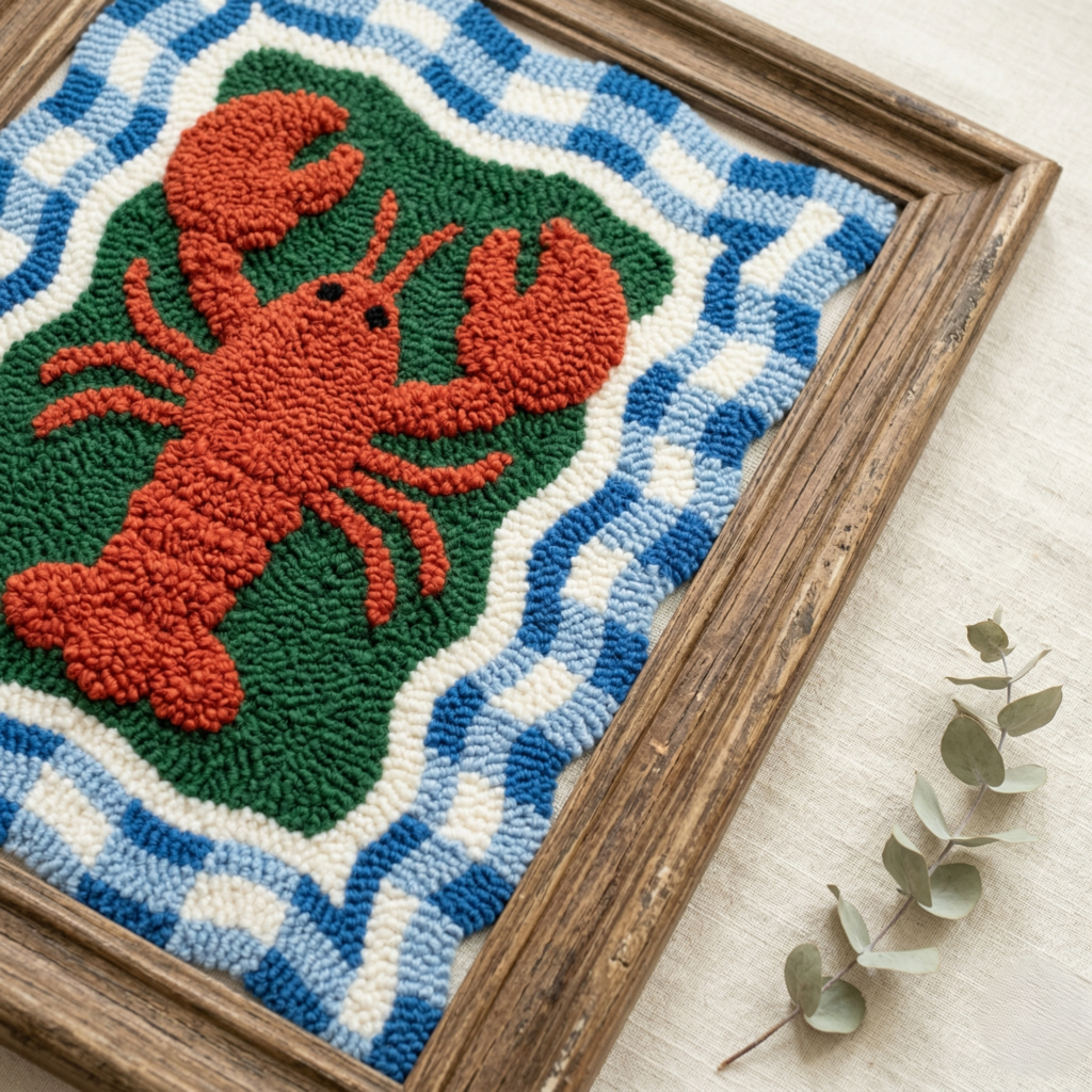
Make it yourself: If you’re looking to create a modern, statement piece, these bold coastal colors are the perfect match for this statement-making Lobster pattern. You can grab my Lobster Punch Needle digital template and test this palette right away!


You May Also Like
6 Cozy & Earthy Color Palettes for Your Next Punch Needle Project
5 Beautiful Ways to Use Your Boho Punch Needle Coaster Pattern